
Colour Psychology in Advertising: Crafting the Perfect Visual

Did you know that using a signature colour can increase brand recognition by 80% or that colours alone are responsible for 60% of users’ acceptance or rejection of a product? These aren’t just numbers — they’re cold, hard facts about how colour shapes advertising.
But why does colour wield such influence? How can the right palette turn a casual viewer into a loyal customer? Stay with us as we unravel the secrets behind the hues that define the world of advertising.
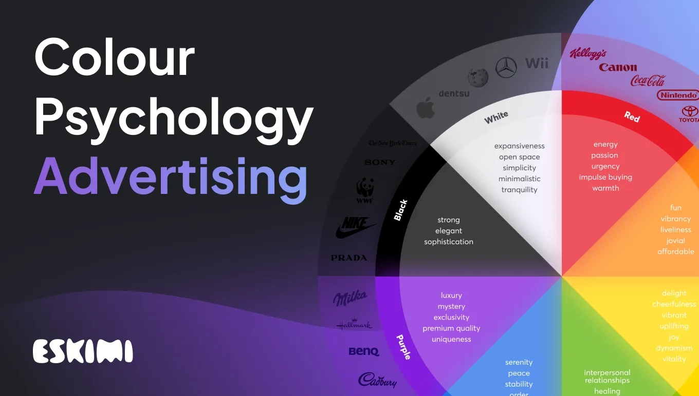
What is colour psychology?
Colour psychology is the study of how colours influence human behaviour and emotions. It is based on the principle that different colours can evoke different feelings, moods, and reactions in individuals. This field intersects aspects of psychology, art, and marketing to understand the effects of colours on sight, emotions, and consumer behaviour.
How colours affect emotions and decision-making
Colours have the power to evoke a wide range of emotional responses. For instance, blue, the most popular colour in the world, instils a sense of calm and trust, making it a favourite for financial institutions. On the other hand, red can trigger excitement and urgency, which is why it's frequently used as a CTA. HubSpot, for example, changed its call-to-action button from green to red, which resulted in a 21% increase in conversions.
Cultural interpretations: The interpretation of colours can vary significantly across different cultures. For example, while white is associated with purity and weddings in Western cultures, it is often linked to mourning in some Eastern cultures. Understanding these cultural nuances is crucial for global brands.
Colour and brand associations: The consistent use of specific colours in branding helps form a strong brand identity. For example, the green in Starbucks’ logo is associated with relaxation and environmental consciousness, aligning with their brand image.
Influencing purchasing decisions: Colour can significantly influence consumer purchasing decisions. Bright and bold colours like yellow and orange can capture attention and encourage impulse buying, while cooler tones like green and blue can create a perception of quality and reliability.
Colour trends and relevance: Staying abreast of colour trends is essential, as these can shift consumer preferences. However, choosing colours that align with the brand’s personality and values is equally important rather than simply following trends.

The science behind colour psychology
Recent studies have shed light on how different hues can drive engagement in advertising. Let’s investigate some of these findings to understand the intricate relationship between colours and consumer responses.
Research studies and findings
Emotional resonance: A 2010 study by the University of Rochester revealed that red, often associated with urgency, can increase excitement and is frequently used in clearance sales to stimulate quick decision-making. Blue fosters trust and security, making it a popular choice in banking and healthcare ads.
Colour preferences across genders: Research by Hallock in 2003 highlighted gender differences in colour preferences. 57% of men said that blue was their favourite colour, while 26% of all participants said that they considered orange a “cheap” colour. To solidify the research above, in 2017, Doctors Anya Hurlbert and Yazhu Ling ran an experiment to see how men and women perceive colour. The experiment showed that men and women both preferred blue out of the sets of colours.
Colour psychology in logo design
The world of colour choices in logo design is fascinating. Let’s explore how top brands utilize specific hues to convey their brand identity, ethos, and values.
Red: Coca-Cola

Coca-Cola's use of red is strategic, as red is a powerful colour that evokes excitement, passion, and energy. It's attention-grabbing and is associated with strong emotions, which helps create a memorable brand image that stands out in the beverage industry.
Blue: LinkedIn
Blue signifies trust, dependability, and professionalism. This colour is often associated with corporate and business environments, making it ideal for a professional networking platform. It evokes a sense of security and reliability, which is crucial for building professional relationships.
Green: Whole Foods
Green in the Whole Foods logo symbolizes nature, health, and wellness. This colour is commonly associated with organic, natural products and sustainability, aligning perfectly with Whole Foods' brand identity as a retailer of natural and organic foods.
Yellow: Caterpillar

Caterpillar's use of yellow in their logo is a strategic choice that leverages the colour’s associations with optimism, energy, and visibility. Yellow, a highly visible colour even from a distance, aligns perfectly with Caterpillar’s heavy machinery and construction equipment, signalling caution and attention. Moreover, yellow evokes confidence and reliability, attributes which are essential in the construction industry, where safety and dependability are paramount.
Orange: Easyjet
EasyJet employs orange in its logo to evoke feelings of adventure, affordability, and accessibility. Orange, a blend of red's passion and yellow's joy resonates with youthful energy and affordability. It's an inviting colour that suggests a friendly and approachable brand, aligning with EasyJet's mission to make air travel more accessible to everyone. Additionally, orange stands out in crowded airports, making the brand easily recognizable.
Purple: Cadbury's

Cadbury's use of purple in its logo taps into the colour’s historical association with luxury and exclusivity. Purple, often linked to royalty and sophistication, helps position Cadbury's products as special treats or indulgences. This choice differentiates their chocolate in a competitive market, aligning the brand with quality and a touch of extravagance, appealing to consumers' desire for a luxurious chocolate experience.
The power of colour in gaining attention
Statistics reveal the profound impact of colour on consumer behaviour. According to a study by the Seoul International Color Expo, approximately 92.6% of people surveyed said that colour was the most important factor influencing their purchase decisions. This emphasizes how crucial colour choice is in advertising to grab attention effectively.
Research shows that ads in colour are read up to 42% more often than those in black and white. This statistic is a compelling argument for the use of colour in advertising to enhance visibility and grab attention.
What does red represent?
Red is often associated with energy, passion, and urgency. According to research, exposure to red elevates blood pressure and increases heart and respiration rates. Some of its most popular implications include:
- Captures attention quickly, making it ideal for clearance sales and call-to-action buttons.
- Evokes strong emotions like excitement, love, or aggression, impacting impulse buying.
- Often used in the food industry to stimulate appetite and convey warmth.
This Eskimi ad is a perfect example of how a brand like Coca-Cola generates buzz, energy and excitement in a red backdrop. The colour catches your eye, leaves no doubt on which brand this is and creates a sense of urgency.
What does blue represent?
As mentioned before, blue is the world’s most popular colour, and the research and science behind it are fascinating. Let’s look at some of the findings:
- The colour blue evokes a sense of serenity and relaxation. It's commonly associated with feelings of peace, stability, and order.
- Physiologically, blue has notable effects, such as decreasing heart rates, inducing a calming, sleep-inducing effect, and it may also reduce body temperature.
- The colour blue is symbolic of trustworthiness, commitment, courage, and fidelity. It's a preferred colour for uniforms in various American law enforcement agencies due to its association with authority and the sense of safety it provides, particularly in darker shades.
- In a professional setting, the blue throat chakra is linked to higher employee loyalty and a stronger focus on achieving objectives.
This Eskimi ad in blue evokes feelings of trust, professionalism and seriousness — precisely what you need to promote a financial product.
What does yellow symbolize?
The renowned artist Vincent Van Gogh once remarked, "Yellow is a splendid colour that symbolizes the sun." Indeed, for numerous individuals, the colour yellow embodies sensations of delight and cheerfulness.
Yellow is widely regarded as a vibrant and uplifting hue. Marketers often employ it to capture attention and instil a feeling of joy.
According to Verywell Mind, yellow is frequently associated with dynamism and vitality. This energetic colour is commonly utilized in contexts and items designed to generate enthusiasm or vigour.
What does white symbolize?
White is everywhere, but what does it mean in a marketing setting? According to research:
- White's luminosity is known for its ability to enhance spatial perception and add vivid accents. Design experts commonly utilize white to give the impression of a more expansive and open space in interior design.
- White often represents simplicity and minimalistic design. This can bring tranquillity and cleanliness for some, yet for others, it might seem too plain or unadorned.
The white line and the use of white hues in this Eskimi ad are simple, minimal and easy to understand and follow. The colour is used to simplify the ad interaction. Also, white is the colour of most street lines, creating a familiar setting for the viewer.
What does the colour green represent?
Green is often linked with nature and health. But as with everything, there are deeper layers of meaning.
- The hue of green is linked to enhancing cognitive function, interpersonal relationships, and physical well-being. This soothing colour is believed to reduce stress and promote healing, which is why it's frequently used in the interiors of healthcare facilities.
- A study has shown that different tones of green are effective in creating a calming atmosphere in unfamiliar environments. This is why interior designers frequently incorporate green elements in communal spaces like restaurants and hotels.
- Green is widely associated with vitality and good health, a concept supported by various scientific studies. For instance, the Japanese practice of "forest bathing," which involves immersing oneself in green-rich natural environments, has been shown to reduce blood pressure compared to those not engaging in this activity.
- While green is often seen as a tranquil colour, it also has the power to energize and motivate specific individuals. Research indicates that highly ambitious people prefer green over red, unlike those with lower ambition levels. Additionally, study subjects linked red with failure and green with success.
- Research indicates that exposure to the colour green can stimulate creative thinking.
- In an experimental study, participants were shown emotionally charged words in various colours and later asked to recall specific words. The results showed a higher recall rate for positive words written in green, suggesting that the colour green might evoke more positive emotional responses.
What does purple represent?
Purple, a colour of luxury and mystery, conveys a sense of exclusivity and premium quality. It’s ideal for brands that emphasize innovation and uniqueness and is often used in products and services related to wellness and spirituality.
- The perception of this colour as a symbol of regality and opulence originates from its historical association with monarchy. This stems from the rarity and high cost of the dye in ancient times, making it a marker of wealth and status. Only the affluent and noble had access to this colour due to its natural scarcity and the expensive resources required for its production. These connotations of luxury and nobility continue to influence its perception today.
- This hue is often linked to mystique, spirituality, and creativity.
- This colour is also emblematic of wisdom and spirituality. Its scarcity and enigmatic qualities may contribute to its association with the mystical, otherworldly, and sacred realms.
What does the colour orange represent?
Orange, a blend of red's energy and yellow's cheerfulness, ussualy conveys a sense of fun and vibrancy, suitable for youthful and energetic brands. Research has indicated a connection between the hue orange and sensations of liveliness and fun.
The colour also has varying reactions among consumers. It is often seen as jovial and welcoming in advertising and goods, with customers commonly linking it with more affordable items.
Orange is Fanta, and Fanta is orange. The Eskimi ad plays on the beverage's brand identity to create an ad that's fun, exciting and playful.
What is the meaning of the colour black?
Black is a bedrock of design, art and fashion. As you would expect, it’s a colour that comes with numerous associated connotations. The colour is often described as strong and elegant. The colour oozes sophistication, and it’s the reason why high-end brands like Tiffany & Co. and Chanel utilize it in their logos.
This Eskimi ad works on so many levels. The story of Samson and his hair is a well-known tale from the Biblical Book of Judges. Samson, a Nazirite with immense strength, had his power linked to his uncut hair. Couple that with the strength and power connotations of the black colour, and what you get is an ad for a magic hair product. Isn't it great when things just work?
How to create a colour psychology chart for your brand
Creating a colour psychology chart is an added layer of building a brand that resonates. Like the Year Wheel Planner, the more internal assets you have, the more you can establish your brand values and actions. Where do you start, though? Let’s guide you through some basic steps.
Assessing your brand identity
The first step in creating a colour psychology chart for your brand is to assess your brand identity thoroughly. What emotions do you want your brand to evoke? Are you aiming for excitement and passion, or are you more about trust and reliability? The answers to these questions will guide your colour choices. For example, a brand focusing on sustainability might lean towards greens and earthy tones, symbolizing nature and growth.
Researching your audience
Understanding your target audience is crucial. Different demographics can have varying responses to colours. Cultural differences, age groups, and gender can affect how colours are perceived and processed. Researching your audience will help you tailor your colour choices to resonate best with your target market.
Creating the colour psychology chart
This chart should map out primary and secondary colours that align with your brand values and audience preferences.
- Primary colours: These are the main colours that represent your brand. They should align closely with your brand's core values and message.
- Secondary colours: These colours provide additional nuance and depth to your brand palette. They can be used for accents, backgrounds, or to highlight important information.
Testing and iteration
Once your colour psychology chart is created, the next step is testing. Implement these colours in your marketing campaigns, website design, and advertising. Monitor engagement metrics, customer feedback, and overall performance. Be prepared to iterate and make adjustments. What looks good on paper might not always translate perfectly in practice.
Let’s paint the perfect ad together
Our team at Eskimi can help you pick the right colour for your ads. Colours evoke emotions and influence buying decisions, and we’re here to help you craft the perfect visual. Do not hesitate to contact us.
Level Up Your Advertising with Eskimi
- Reach 96% of Open Web
- 2,500+ Targeting Options
- 100% Managed or Self-Service
- In-House Creative Studio Team
- Display, Video, In-Game & CTV
- #1 Rated DSP on G2